About

The Inkbeagle project started as part of the PhD research of Lennert Loos who investigated the use of interactive data visualisation for structural designers and engineers.

The Inkbeagle project seeks ways in which an informed design process for (structural) designers can be facilitated. Academic research on the act of structural designing and how designers make decisions points out that designers do want to make informed decisions, but that this is not always possible due to time constraints or (digital) interfaces that do not allow for this.

The Inkbeagle project started as a proof-of-concept to create interactive data visualisations from structural finite element models. As designers tend to generate multiple design alternatives, assess these and select the most promising solutions from the set, great emphasis has been laid on the allowance to compare multiple design solutions simultaneously. Data visualization is able to compress large amounts of data into an understandable representation, this approach was indeed assessed as very valuable by designers from the professional field.

   Proof-of-concept piece of software, used to investigate the practical use of interactive data visualisations for structural design. (Loos, L., 2019, Vrije Universiteit Brussel)
Generating, comparing and selecting...

Computational tools such as for instance parametric design and form-finding allow structural designers to quickly generate different structural design alternatives. The structural designer then typically wants to understand the differences between these generated structural models and their behaviour. By this understanding, informed design decisions can be made. In engineering practices, it can be observed that the commonly used finite element tools are not always appropriate to quickly and qualitatively compare the structural behaviour of various structural models. The structural results of these finite element tools provide in general quantitative data in tabular format and visual representations such as force diagrams. Where these tools mainly aim at the understanding and analysis of a single structure, interpreting a set of alternatives might become time consuming.

Visualising data

Within a computational design workflow, a lot of structural data and results can be obtained immediately. The research project that initiated the Inkbeagle project investigated whether the structural understanding and comparison of the behaviour of various structural design alternatives can be facilitated by using interactive visualisations of the available structural data.

In the paper Web Based Data Visualisation Applied to Creative Decision Making in Parametric Design, it is correctly stated that the quantitative data output of structural analysis software is often shown in table format and that 'this fits into current workflows where often engineers manually copy large tabular information into Excel spreadsheets, which are developed individually by the engineer to generate new tables and further calculations to summarize and digest this information'. This paper holds the opinion that this way of working is not appropriate at all for comparing various designs and to understand the influence of certain parameters on the structural behaviour.

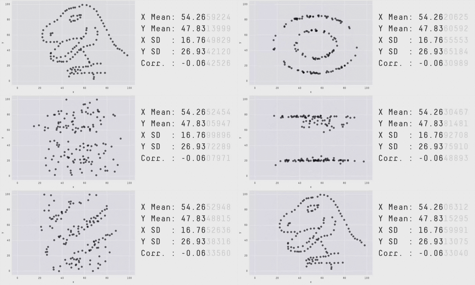
In addition, the use of visual data representations is underrated. The publication Same Stats, Different Graphs shows the importance of visual representations in order to understand the relations in a data set (Cfr. picture underneath). While all datasets have identical summary statistics, the datasets are totally different. The insights that can be gained from plotting data are totally different than those gained from summarising numbers.

In the case of structural data (internal forces, displacements...) these summary statistics will lead to false assumptions since they have rarely a clear center point and often form different clusters, exhibiting different structural behaviours on the level of the structural elements.

In order to work more easily with data in Grasshopper, Inkbeagle Data is developed.

Currently Inkbeagle Canvas is being developed. This tool will allow to create interactive graphs from data managed with Inkbeagle Data.

Informed design facilitates an integrated design approach

The Inkbeagle project was initiated by the academic research on using interactive data visualisation in structural design to more quickly and more adequately point out differences and similarities between different structural design proposals. Emphasis is thus laid on comparing as this is inherit to the act of designing and the exploration of the design space.

The specific focus was on the use of interactive data visualisations and graphs as a tool for informed decision-making, but it's philosophy is framed within the overall idea of integrated design. An integrated design approach searches for interdisciplinary design solutions in which all of these disciplines are working together as a whole, as a synergy. With this approach in mind, the search for the strict structural optimum is pointless since it is on the one hand not able to consider non-numeric design criteria, such as aesthetics, functionality and program. On the other hand the search for compromises with other disciplines is necessary and therefore the strict structural optimum is canceled.

Furthermore, the human design and decision-making process is complex, highly non-linear and often includes design parameters that are non-numeric and difficult to include in optimisation algorithms. Because of this, the search for new approaches that allow for a guidance-based design process while being informed about the different design solutions is desirable, especially during the conceptual design phase.

Inkbeagle is an ongoing project that attempts to peel off the current difficulties in understanding and comparing structural alternatives while designing.